Creating a Chart
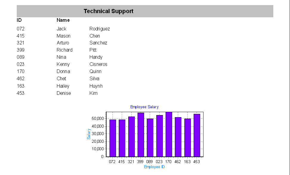
This example will demonstrate how to add a simple chart to a Banded Report as shown in the figure below.

The report contains a list of employees (ID and name) within a department and a chart showing the salary of each employee.
The Employees Table within the sample database is the only table used in this example. A DataBlock form was created in which the user enters the department name.
Four bands are utilized as follows:
- Title band containing the department name (gray background color).
- Column Header band containing the “ID” and “Name” titles.
- Detail band containing the list of employees.
- Summary band containing the chart.
Create the Title, Column Header, and Detail Bands
Create a new Banded Report, launch the Banded Report Wizard, then select a “Blank Report” Type.
Populate the Title, Column Header, and Detail Bands with the appropriate fields using methods described in previous examples. As a reminder, note that the Title Band contains the value selected in the DataBlock form using the procedure described in a previous example.
Tip: To quickly center the text within the title bar horizontally or vertically, click on the text, then click the “Align the selected control to the horizontal center of its parent” button, or click “Align the selected control to the vertical center of its parent” button.
Align to horizontal center of its parent
Align to vertical center of its parent
The remainder of this example is devoted to creating the chart that will be placed within the Summary Band.

Add a Summary Band
A chart can be added to any type of band. For this example it is added to the Summary Band. Click the "Create a new band" icon  and select Summary for the type.
Add a Chart Object
Click on the Chart icon  on the toolbar, then click anywhere within the Summary Band to add the chart object. The chart wizard welcome screen will appear. Click Next to start the wizard.
Follow the Chart Wizard
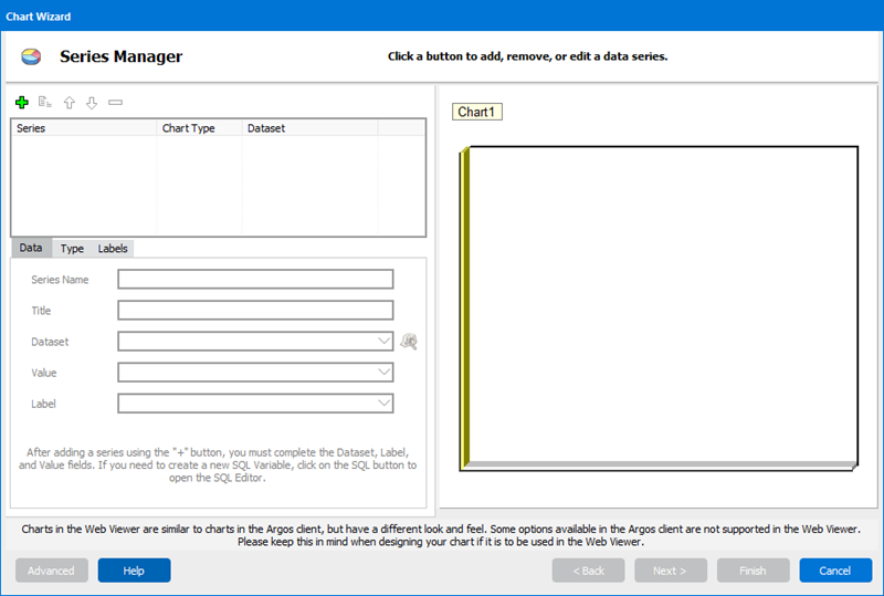
The Chart Wizard that will guide you through the process of creating a chart.
- Click the Green Plus icon
 to add a series. More than one series of data can be displayed on a chart, but for this example only one series will be used.
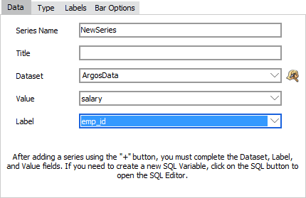
 - Select ArgosData within the Dataset field.
- Select salary for the Value field.
- Select emp_id for the Label field.
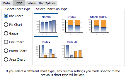
- Click the Type tab where you can select various types of charts (Bar, Pie, Line, etc.). This example creates a bar chart which is the default selection, so no change is required.
- Click on the Labels tab to display various label options.
- Uncheck the “Visible Label” box. This removes the label from the top of each bar in the chart. For more information about labels, refer to the Chart Wizard documentation.
- Click Next to continue to the Chart Theme and Panel screen. Here you can adjust the theme, colors, and borders. For this example, we will be using the default settings.
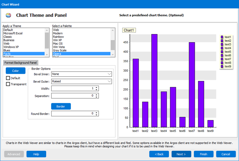
- Click Next to continue to the Chart Legend and Titles screen.
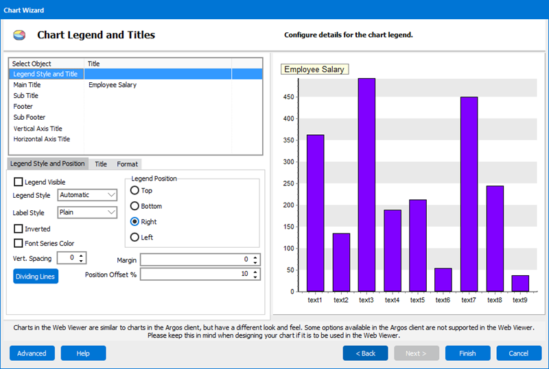
- Highlight Legend Style and Title in the object listbox in the upper left corner.
- Uncheck the Legend Visible check box. We will not be using the legend in this example.
- Click “Main Title” in the object listbox.
- Enter “Employee Salary” into the “Enter Title Here” box.
- Click Vertical Axis Title then enter “Salary” for into the “Enter Title Here” box.
- Click Horizontal Axis Title then enter “Employee ID” into the “Enter Title Here” box.
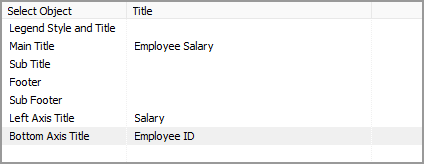
- Click Finish to return to the Band Report Editor.
Info: See the Argos DataBlock Designer Guide for a more complete description of Charting within Argos.
Increase the height of the Summary Band to make room for the chart. Position the chart to the desired location.
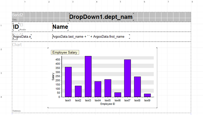
Select “Technical Support” for the Department Name, then run the report.

